
High Level Company Overview
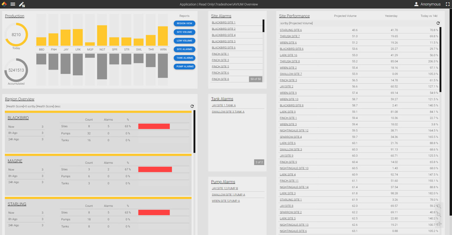
The purpose of this screen is to provide a high-level view of a large distributed site operation. It is meant as a general health assessment for executive management and allows fast drill downs within each section to see assets in a single click.
In the top left, I used a panel, 'Production', to provide rolled-up production figures for each district. The yellow donut gauge and bar graph chart demonstrate today's production while the lower grey is an annual accumulation. To the right are navigation buttons to a series of six pre-built report screens.
Then below on the left in the 'Region Overview', an overview of each district with a health score based on a series of calculations running in the Canary Calculation Server. The districts are sorted by their health score, and based on that health score, the panel is highlighted at top with a different color border (yellow pictured).
The middle columns are built using three Asset Templates, each filtered to show current sites, tanks, and pumps in an alarm state.
Finally, the panel at right, 'Site Performance' has all sites listed in a grid control and displays volume for today, yesterday, and a calculation comparing today vs the 14 day average. Again, sorted by performance.
Note, all assets are hyperlinked so a user can click on them to be taken to a more detailed diagnostic-style application page within Axiom.
1 reply
-
This looks amazing. Would love to try this in one of our installs soon.